[02]
Zone. Making it useful again
Role
Product Designer
Duration
Jun · Oct 2022
Team
A Product Manager
A Product Designer
2 Developers
Type
Product Design
Overview
Just a bit of context
CBRE, an American multinational with offices across Spain, realized that its internal communication channel, Zone, wasn't working as well as it should.
Zone is CBRE's intranet. It functions as a repository for news, files, and dashboards that employees rely on to find key documents before and during meetings. The channel was desktop-only, and over time it became clear that it was outdated and that most employees wanted to access it from their phone or tablet.
The Problem
A poor user experience was costing the company projects
CBRE employees couldn't find the files they needed at critical moments during client meetings. This wasn't just a frustration, it was a business problem. Not being able to pull up the right document at the right time meant losing opportunities to make a strong impression, which translated into financial losses and internal friction between employees and the company.
Many users had resorted to downloading files onto external hardware before meetings, but that workaround removed any possibility of searching in the moment or adapting on the fly.
Main problem: A poor user experience was costing the company money and projects.
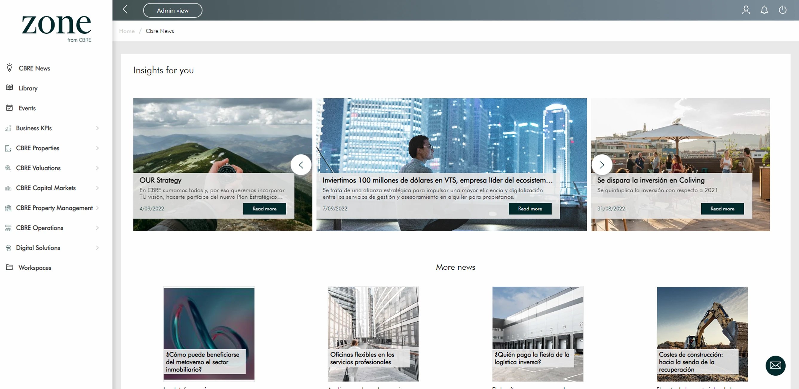
There was also a second, quieter problem: employees were losing their sense of belonging to the company. Most of them weren't keeping up with internal news or events simply because they weren't using Zone at all.
After mapping these problems and aligning with what the business needed, we focused on two goals:
Reduce financial losses by helping employees perform better in client meetings. Improve internal communication between the company and its employees.
Design Process
So, how do we tackle it?
One advantage we had from the start was that Zone already had a defined set of functionalities. The challenge wasn't building something from scratch but understanding what was failing, what was working, and avoiding repeating past mistakes.
We approached this using a Design Thinking methodology. I started by auditing the current portal to identify pain points and map out which flows were causing the most friction.
Since this was an internal tool, we also had direct and easy access to users, which made the research phase much more straightforward than usual.
Research
Because our users were employees of our client, running interviews and surveys was relatively simple. We launched a company-wide survey and complemented it with a round of personal interviews to get a clearer picture of who we were designing for and what they actually needed.
From the interviews, we pulled three key insights:
Users wanted a calendar
Somewhere they could check upcoming company events.
News wasn't a priority for users
Though the company wanted to push this content.
Users kept searching for the same dashboards
To present them across different client meetings.
The survey results added another layer of quantitative data on top of those findings.
Internal surveys
n = 128 employees
1. Usage profile
rarely or never use the app
Do you currently use this app?
do not use it
51%- Yes, frequently9%
- Yes, occasionally18%
- I have used it once22%
- I do not use it51%
How often do you use it?
Among the 63 employees who have used it
2. Finding content
rate finding content as difficult
How easy is it to find content?
- 1 · Very difficult31%
- 2 · Difficult38%
- 3 · Neutral18%
- 4 · Easy9%
- 5 · Very easy4%
What makes finding content hard?
Multi-select · share of respondents
3. Time wasted
take 5+ minutes, or never find it
When looking for a document or chart, how long does it usually take?
How often can’t you find what you’re looking for?
- Never4%
- Rarely12%
- Sometimes38%
- Frequently35%
- Almost always11%
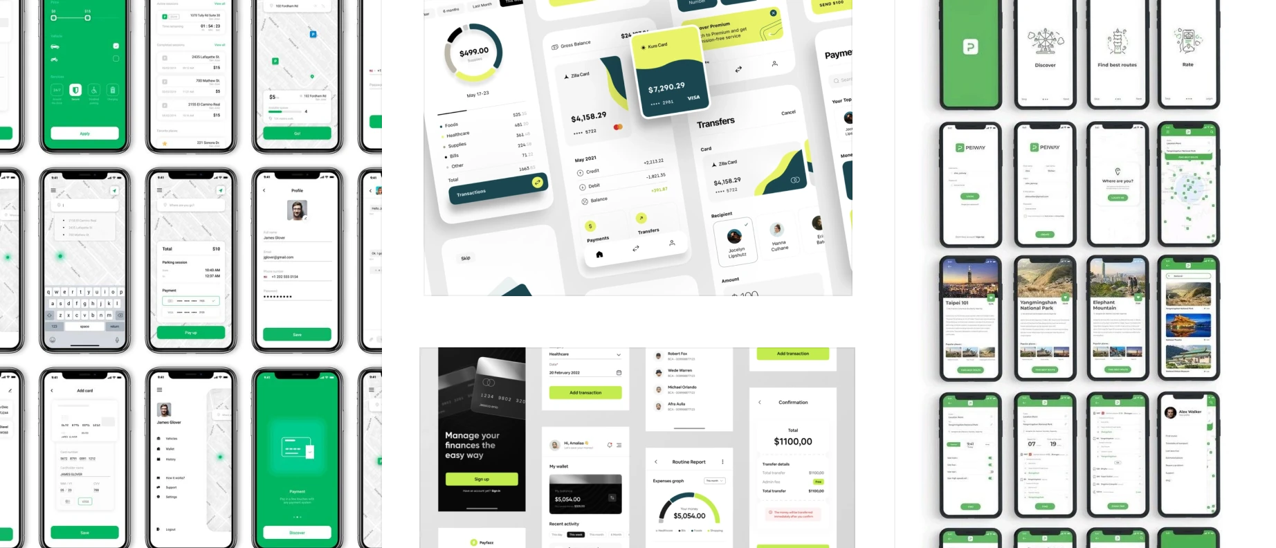
We also ran a visual research session to build a moodboard and get an early sense of the direction we wanted the app to look and feel.
Design Decisions
Keeping the challenges in mind, here's how we moved forward
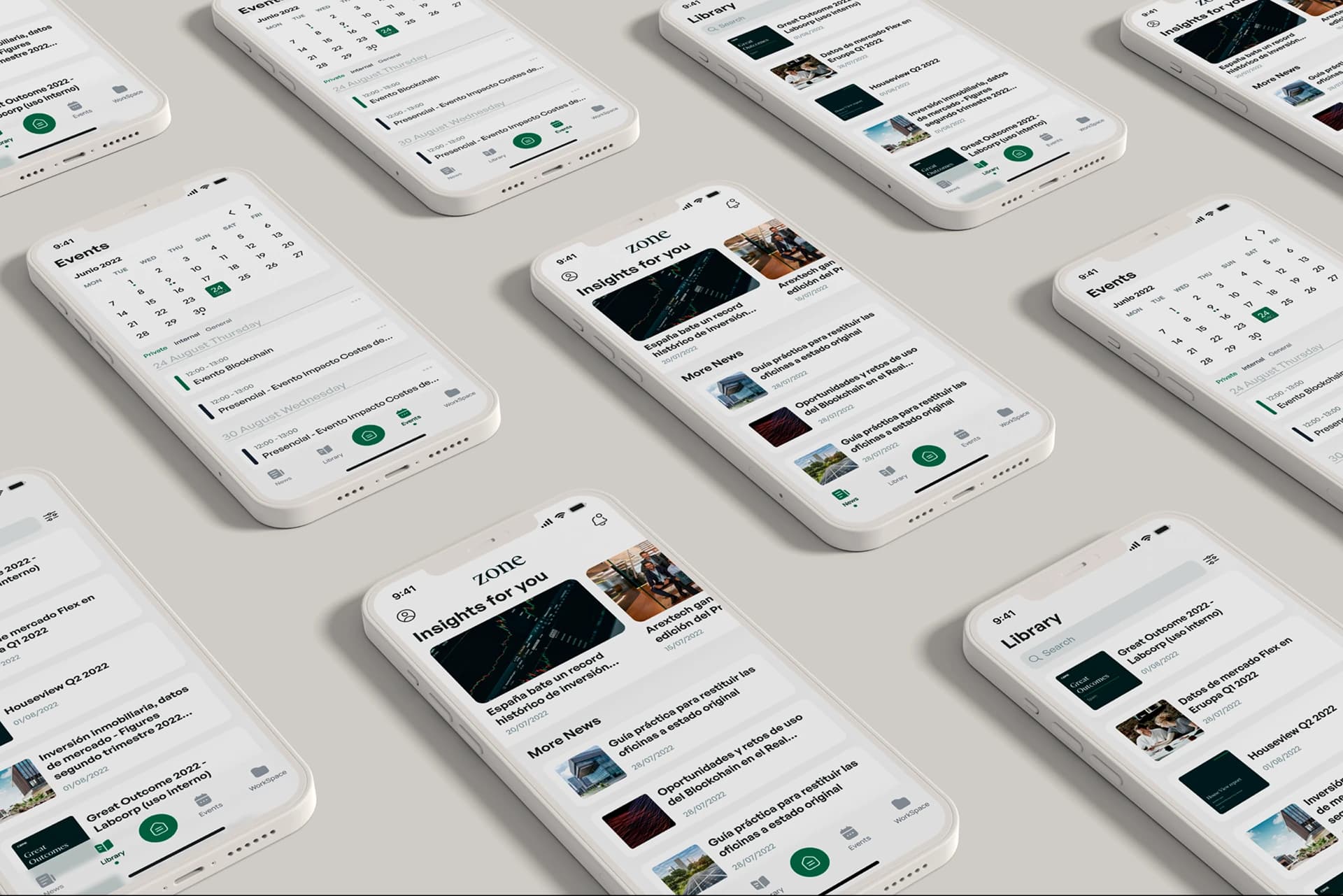
Based on everything we found during research, we decided to design a mobile and tablet app with five core sections. This decision came from a simple observation: most of the commercial team didn't bring laptops to meetings. They brought their phones or tablets.
To address the communication gap between the company and its employees, we made the homepage surface company news and updates. We knew users weren't naturally drawn to this content, but the business saw real value in it, so we found a way to integrate it without it feeling intrusive. We also built a calendar with a short legend so employees could stay on top of company events at a glance.
We also built a calendar with a short legend so employees could stay on top of company events at a glance.
Challenges and Solutions
Halfway through, new problems surfaced
As the design and research progressed, we ran into a couple of issues that hadn't been fully visible at the start.
The first was scalability. Zone was a portal where CBRE planned to upload enormous amounts of data and files, organized through a folder system that could nest indefinitely. That kind of structure is hard to navigate and even harder to scale without it becoming a mess.
The second issue was that dashboards and regular files were mixed together in the same space, which confused users who were looking for one or the other.
We solved this by splitting the content into two distinct sections: Dashboards, for data visualizations and graphs, and Workspace, for all other work-related files.
For the dashboards section, we ran a card sorting exercise with users to classify all existing files and folders, then used those results to define a set of fixed, intuitive folder categories.
Since users frequently needed to find the same dashboards across multiple meetings, we added a favorites folder so they could bookmark files and access them instantly.
Conclusions
Sometimes the simplest decisions are the ones that work best
Once the app launched, we gave users a couple of months to get familiar with it before going back to measure impact. After two months, we ran another internal survey and the results were encouraging.
Follow-up survey results
n = 121 employees · 2 months after launch
1. Usage profile
use the app at least occasionally
Do you currently use this app?
use it frequently
34%- Yes, frequently34%
- Yes, occasionally38%
- I have used it once14%
- I do not use it14%
How often do you use it?
Among the 104 employees who have used it
2. Finding content
say finding content is now easy
How easy is it to find content?
- 1 · Very difficult6%
- 2 · Difficult11%
- 3 · Neutral18%
- 4 · Easy38%
- 5 · Very easy27%
What makes finding content hard?
Multi-select · share of respondents
3. Time wasted
find what they need in under 2 minutes
When looking for a document or chart, how long does it usually take?
How often can’t you find what you’re looking for?
- Never28%
- Rarely41%
- Sometimes22%
- Frequently7%
- Almost always2%
Simple design improvements like adding a calendar or letting users save dashboards to a favorites folder were the features users praised most. Usage of the app increased and so did its acceptance within the company.
From a seed, a strong tree can grow
Even with those wins, plenty remained to be improved: the dashboard and workspace layout, the desktop views, and more. When you're working on a time-boxed project, you have to focus on what moves the needle most and leave the rest for later. But good work tends to compound.
The quality of what we delivered led the client to extend the project, bringing us back to redesign the web version and continue refining the app.