[03]

UCI. Driving Strategy & Optimizing Product

Role

Product Designer

Duration

Jan · Apr 2023

Team

Communication Team
2 Product Designers
3 Developers

Type

Product Design
Product Strategy
Research


Just a bit of context

UCI is a financial institution specializing in mortgage products. For this project, we worked as an embedded design team, focusing on supporting their internal products, improving their design system, and contributing across different product areas.

This case study covers the Communication Room project. If you want to learn more about the broader context, I've linked a post from Redbility, the company I was working for at the time.

Improving communication between stakeholders

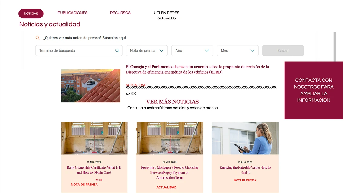
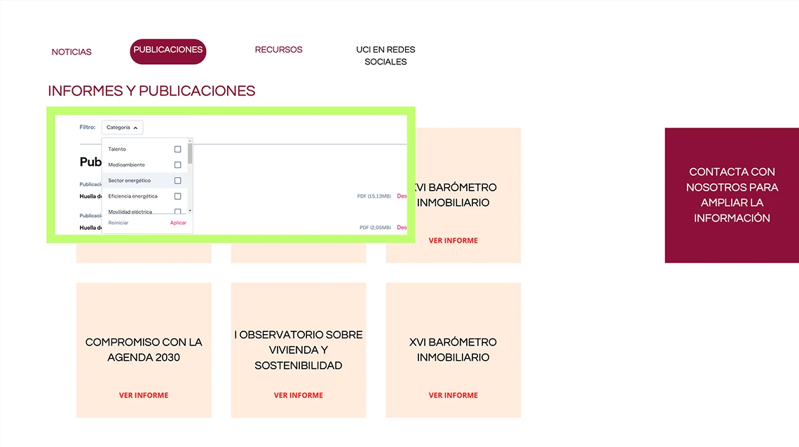
The communications team wanted to integrate a press room into uci.com, making it easy and intuitive to navigate, with the goal of fostering transparent communication between stakeholders. They came in with an initial wireframe and a list of requirements the press room should meet.

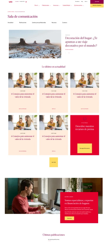
UCI press room wireframe — news section
UCI press room wireframe — publications section

Getting everyone on the same page

To align on goals and clear up questions from our initial analysis, we ran a joint session between the design and communications teams. That first meeting was key: we resolved content questions, sharpened the business objectives, developed a shared understanding of our users, and laid out the first steps in our strategy.

  • What is the business goal of the Communication Room?
    • Foster transparent communication between stakeholders
  • Who is it aimed at?

Experienced individual user

Comes from the Newsletter

Inexperienced individual user

Comes from the Newsletter

Press

Direct traffic

Real estate or renovation professionals

Comes from the Newsletter

Not relevant

  • Which user matters most to the business? Weigh the users
    • Inexperienced individual user → Build trust
  • Do we have metrics on the current site? Can we talk to someone about them?
    • We'll check with the Marketing team (Bea Arcos)
Communications
Redbility

Defining a realistic roadmap

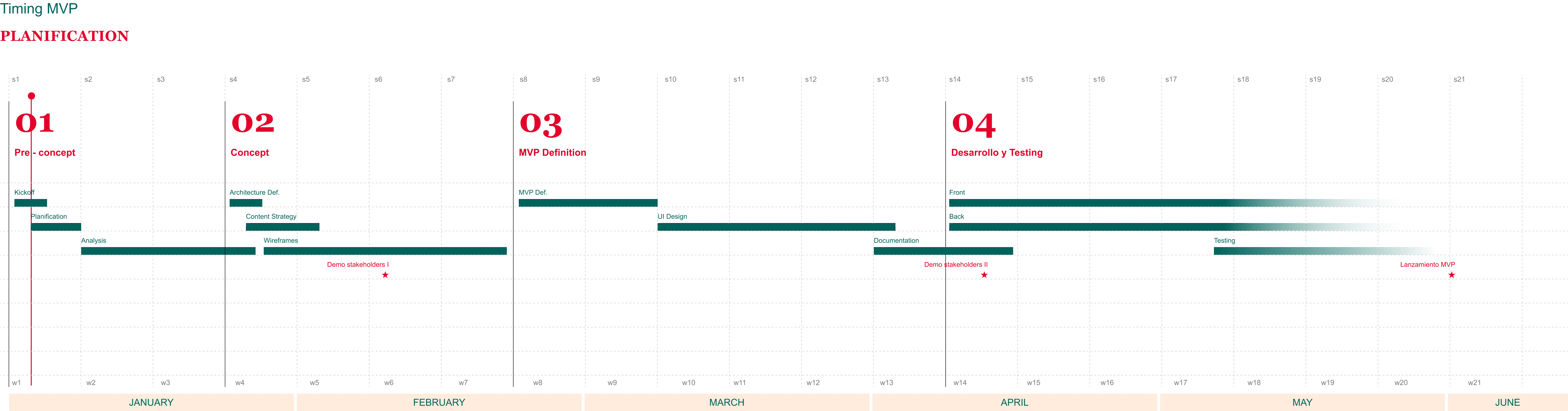
After the alignment session, we put together a project timeline that accounted for business, design, and development needs. After a few rounds of review and factoring in that this wasn't our only active project, we landed on a plan that worked for all teams.

UCI MVP planification timeline

Research to build the best possible MVP

With the timeline approved, we started the analysis phase. We focused on four areas: the current state of the website, site metrics, user definition, and a benchmarking study of other financial institutions.

The starting point

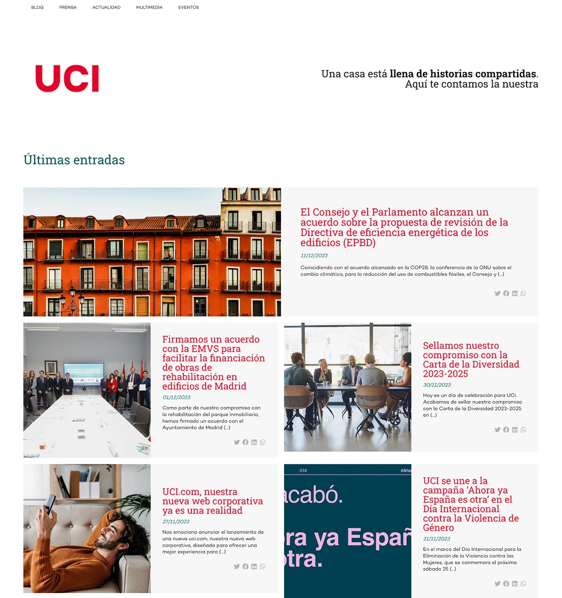
We started by auditing the information architecture and content of the existing press room to understand where we were starting from.

UCI press room website starting point

What do the metrics tell us?

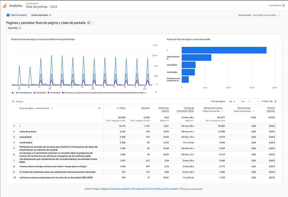
With access to analytics from the dev team, we were able to pull some useful data.

UCI press room most visited pages metrics

Most visited pages

(relevant for prioritizing key sections in the new structure)

  • Landing page / Blog
  • Press releases
  • News
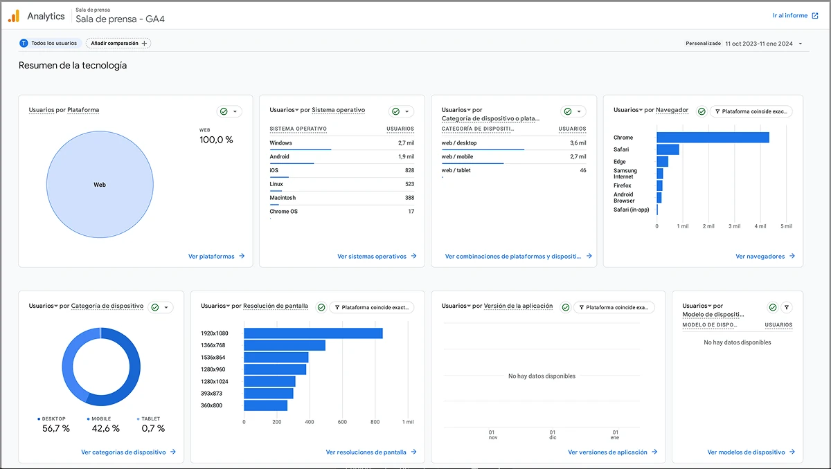
UCI press room device breakdown metrics

Device breakdown

(important for defining breakpoints)

  • 56.7% desktop
  • 42.6% mobile
  • 0.7% tablet

The press room serves four distinct user types

We created brief profiles for each to keep their needs front of mind throughout the design process.

Press

Individuals or organizations connected to the media and journalism space. This user visits the site looking for specific information and resources that can support their editorial work

Content types

  • Press releases
  • Multimedia resources
  • Publications

Experienced individual

A private user with financial knowledge, interested in news, reports and updates related to the financial sector. Their motivations can vary, from making investment decisions to understanding the financial position of a company

Content types

  • News
  • Publications

Inexperienced individual

A private user with little to no knowledge of finance or mortgages who uses the communication room as a reliable and accessible source for clear, easy-to-understand information. This is a key user type for the press room, as it represents an opportunity to build trust in the brand

Content types

  • News

Professional

A real estate professional who uses the communication room to stay up to date on relevant financial and economic information that may directly or indirectly affect their operations and decisions. This is a less critical user type

Content types

  • Events
  • Publications

What variables did we include in our benchmark?

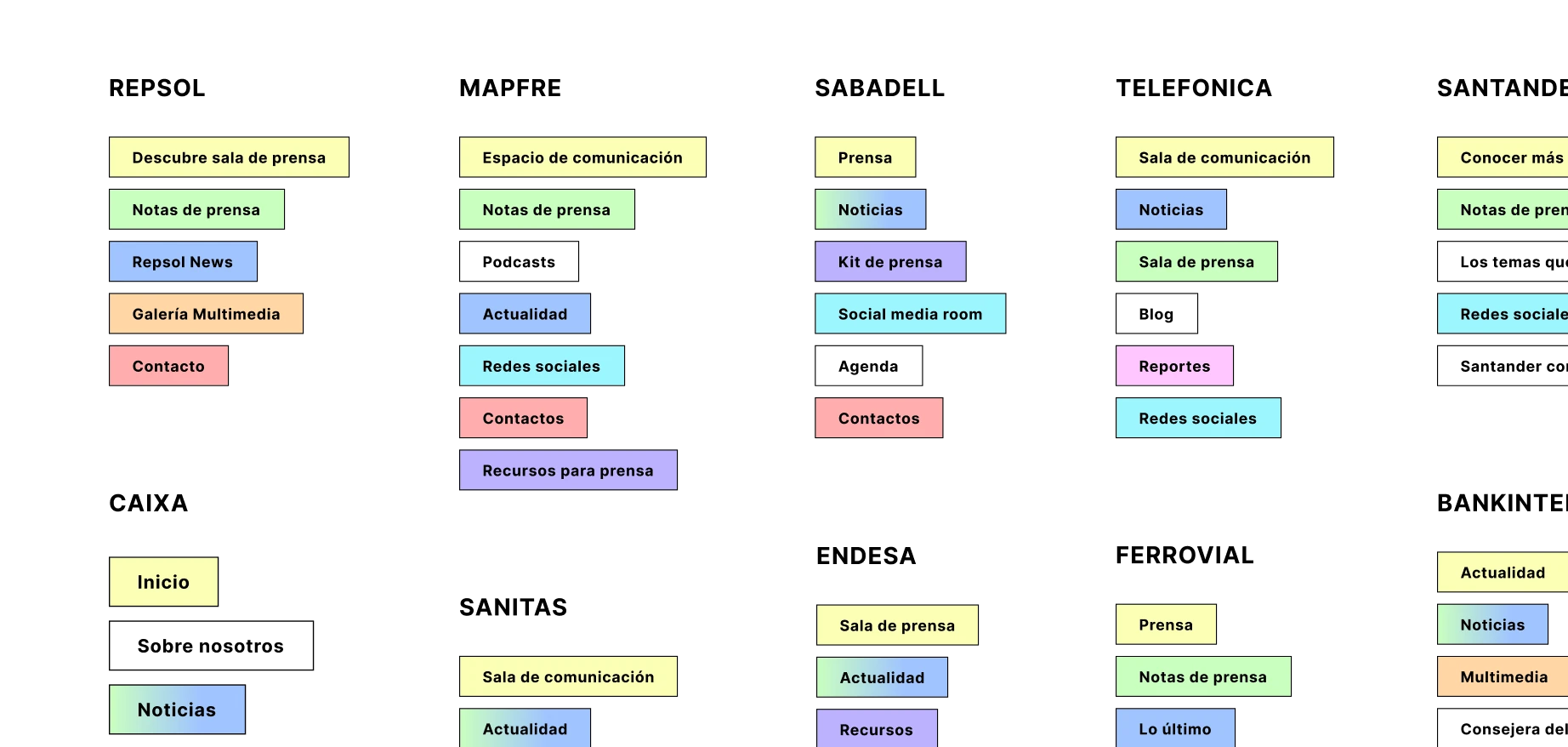
Naming

In the context of a website, naming refers to the process of choosing and creating a name for a site, product or service.

Access point

The access point on a website is a specific location or entry path that serves as the main gateway to reach information.

Information architecture and navigation

We understand information architecture as the practice of deciding how to organize the parts of something so that it can be easily understood.

Content types

Web content refers to any file hosted on a website that is transmitted and delivered through a web browser.

Hub page structure

This page acts as a central point from which users can access specific content or navigate to subtopics.

News and press releases

This refers to how news articles and press releases are presented and structured on a website, taking into account the different user types they are aimed at.

Sites analyzed

Naming

TelefónicaSantanderBankinterSanitas

42% of the sites analyzed use the name Communication Room (Sala de Comunicación).

RepsolINGBNP Paribas

33% of the sites analyzed use the name Press Room (Sala de prensa).

FerrovialBanco SabadellMAPFRE

17% of the sites analyzed use the name Press (Prensa).

Endesa

The remaining 8% use Communication Space (Espacio de comunicación).

We recommended adopting "Communication Room" ("Sala de Comunicación") as it signals a space for all stakeholders, not just press.

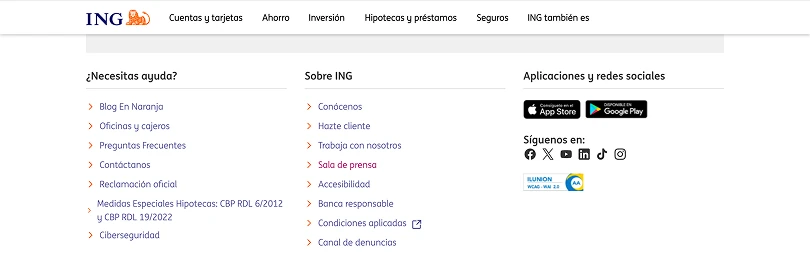
Access point

Looking at how these sections are surfaced within their respective sites:

TelefónicaSantanderBankinterSanitasRepsolINGBNP ParibasFerrovialBanco SabadellMAPFREEndesa
  • Main nav item (73%)
  • Footer (18%)
  • Secondary nav item (9%)
For a corporate website, the clear pattern is main navigation.

Architecture and navigation

We mapped out the information architecture of each site and color-coded content types to identify the most common patterns.

Press room information architecture comparison across benchmarked sites
  • Nearly all sites have a hub page that acts as the press room homepage.
  • 50% separate press releases from general news, while the other 50% group everything under "News" and use filters.
  • 60% include a dedicated social media section.
  • 70% have a dedicated press contacts page.
  • 50% group downloadable resources in a single section.
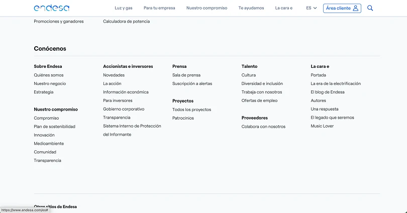
Endesa press room mega menu navigation
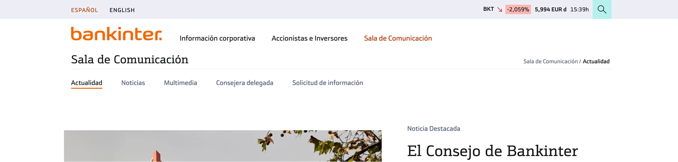
Bankinter press room anchor menu navigation
Press room anchor menu on article page
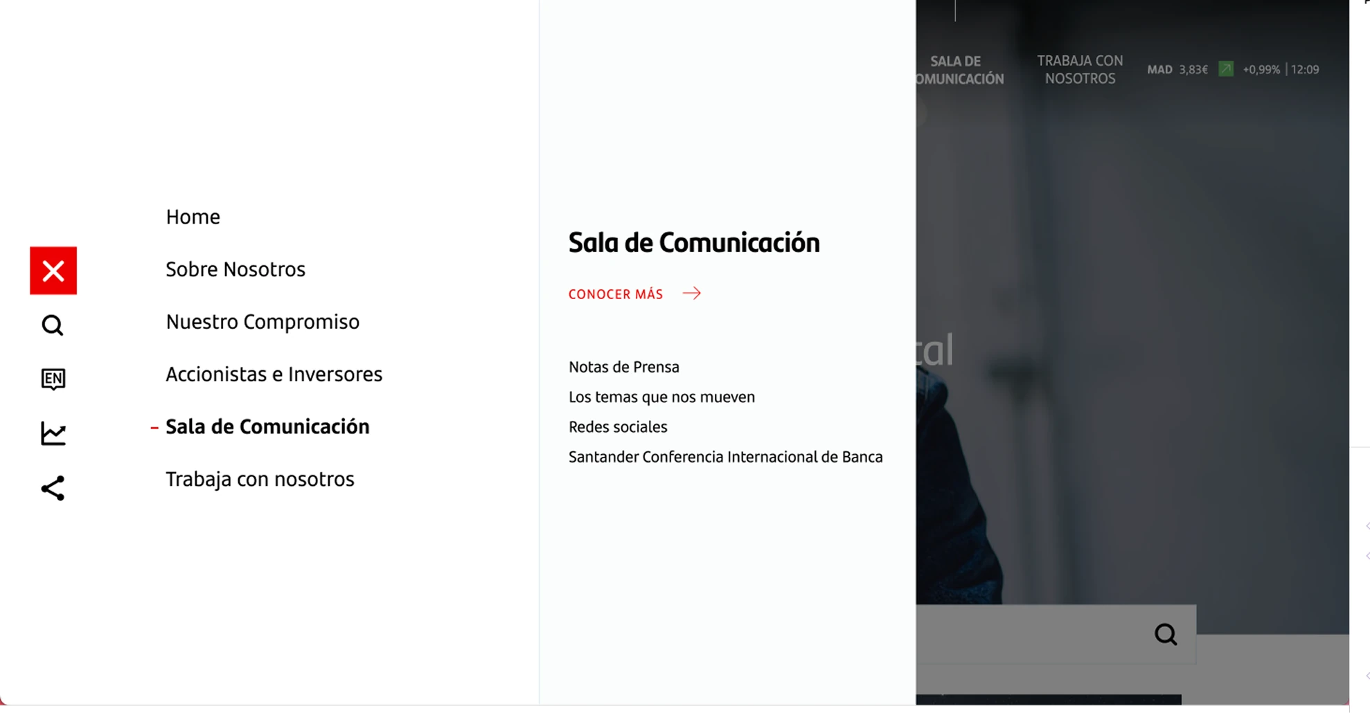
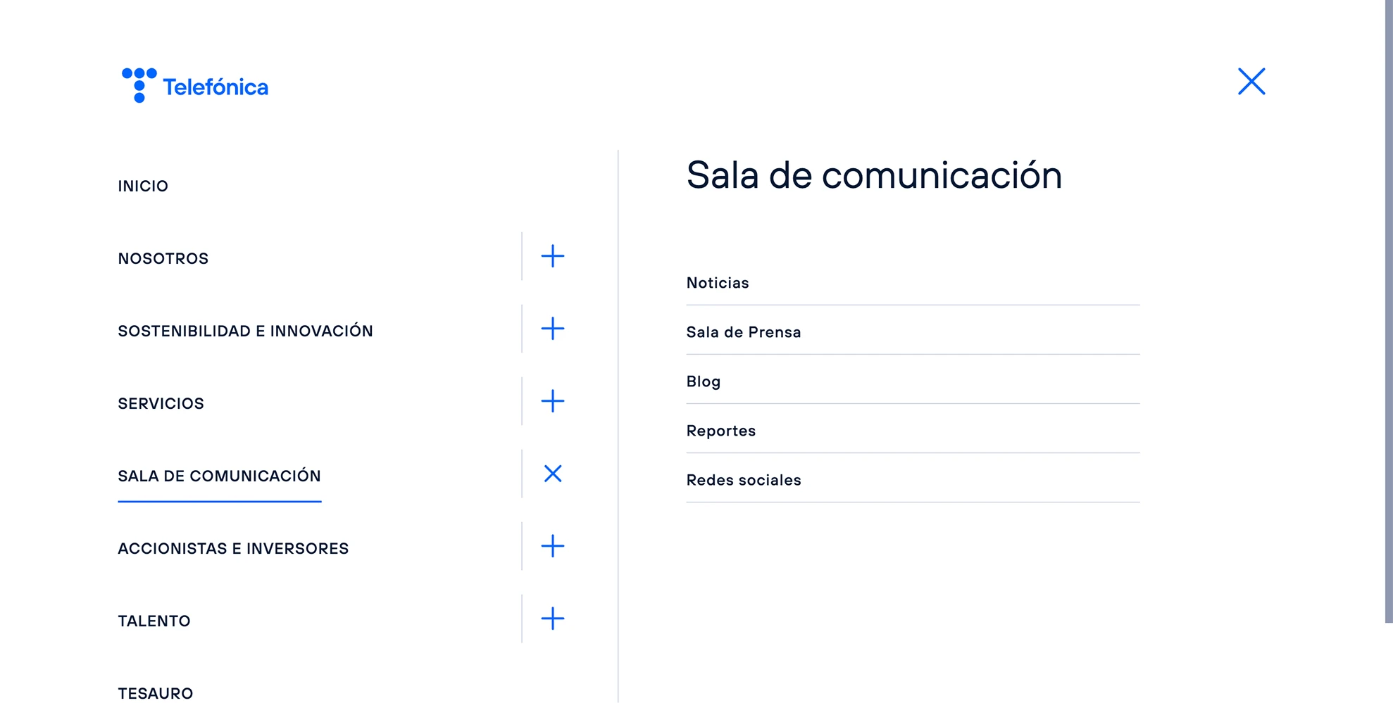
Telefónica press room mega menu navigation
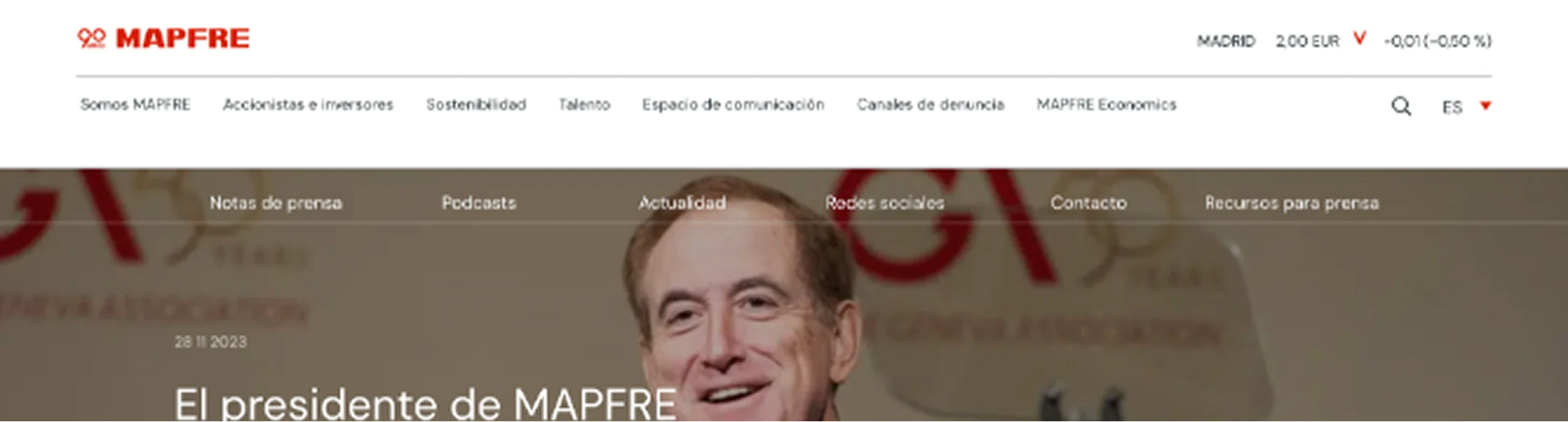
MAPFRE press room anchor menu navigation

For navigation, the sites we analyzed break down like this:

  • 40% mega menu
  • 40% secondary navigation or anchor menus
  • 10% hub page only, no additional nav
  • 10% main site navigation only
We recommended a second navigation level, taking advantage of a component that already existed in our Design System.

Content types

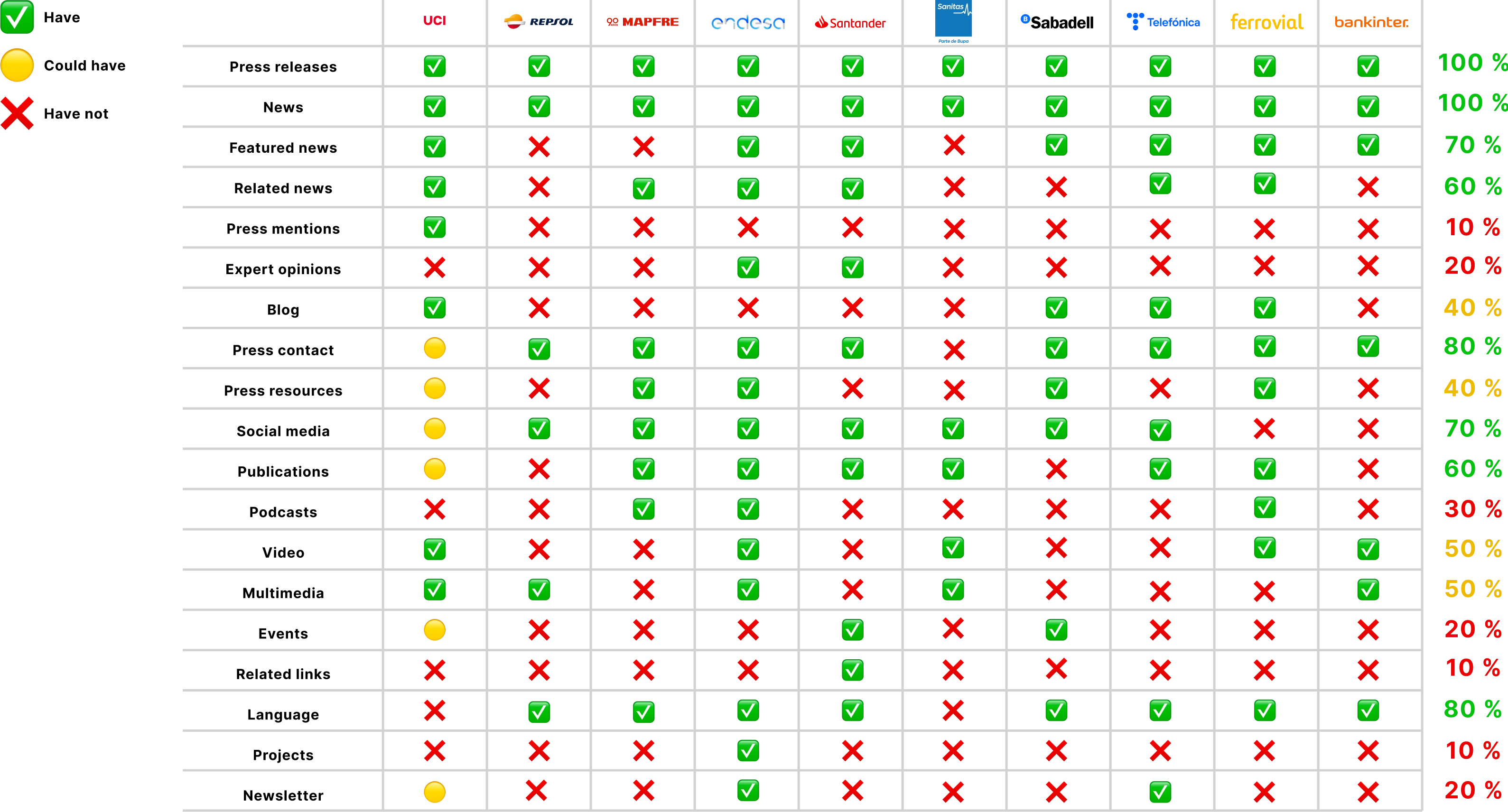
Most sites are fairly aligned on content. A few things stood out for UCI specifically:

Press room content typology comparison across benchmarked sites
  • Press mentions: something UCI already does well and should keep.
  • Expert opinion pieces: build credibility and could be a differentiator.
  • Podcast: always highlighted where it exists, which gives us a case for surfacing UCITalks more prominently.
  • Events: worth keeping given UCI's active calendar.
  • Language: 80% of sites offer the press room in both Spanish and English, something worth exploring for UCI down the line.

Hub page structure

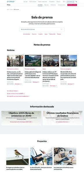
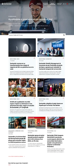
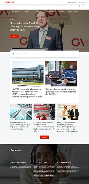
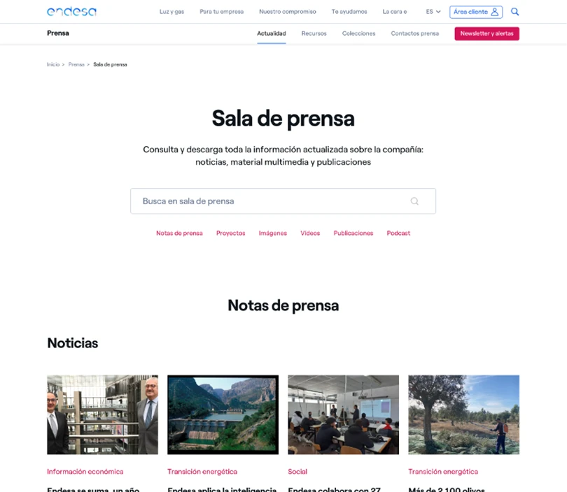
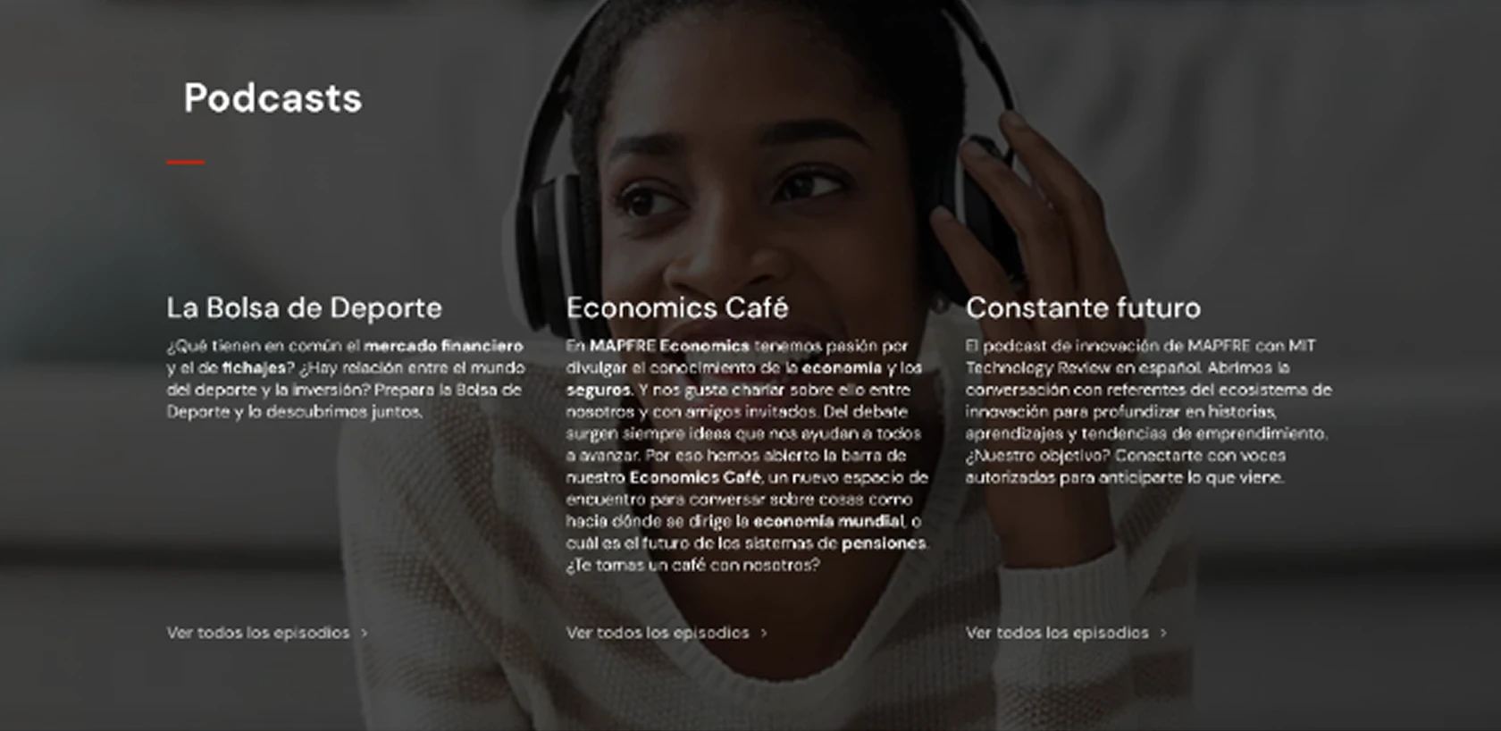
Almost every site uses a hub page as the entry point to the press room. The first content users encounter is always news and press releases.

Endesa press room hub pageSantander press room hub pageMAPFRE press room hub page

What usage patterns repeat the most?

The first content users encounter on the page is always news and press releases.

Endesa press room sitewide search bar

What best practices can we identify?

Endesa makes strong use of a sitewide search bar across the entire Press Room. This makes sense when there's a large volume of content.

Podcast section highlighted on a press room hub page

What content is being highlighted the most?

Pages tend to emphasize unusual content that stands out from competitors. (e.g. podcasts)

Nearly all of the sites analyzed use a hub page as the press room homepage.

Article detail patterns

Common patterns worth bringing into UCI's design:

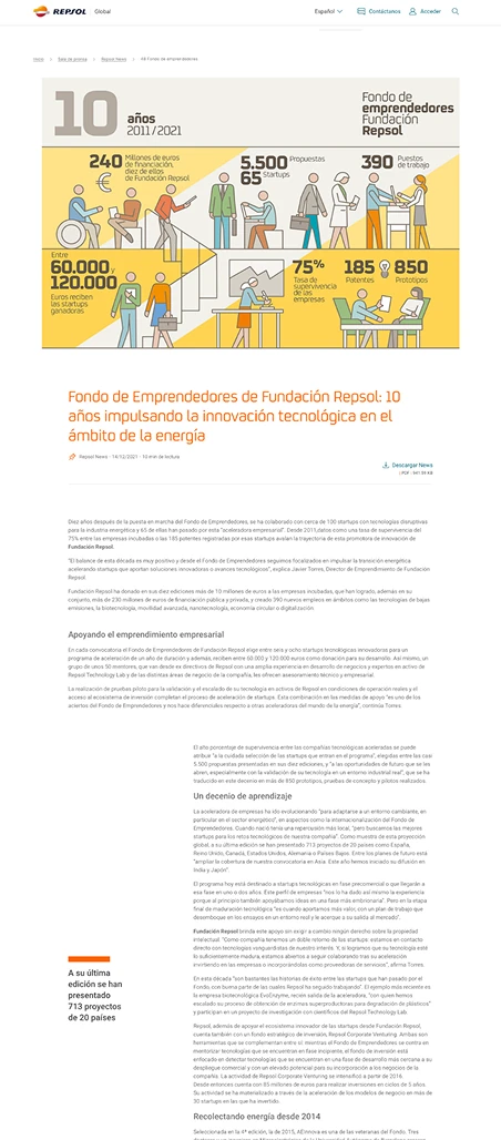
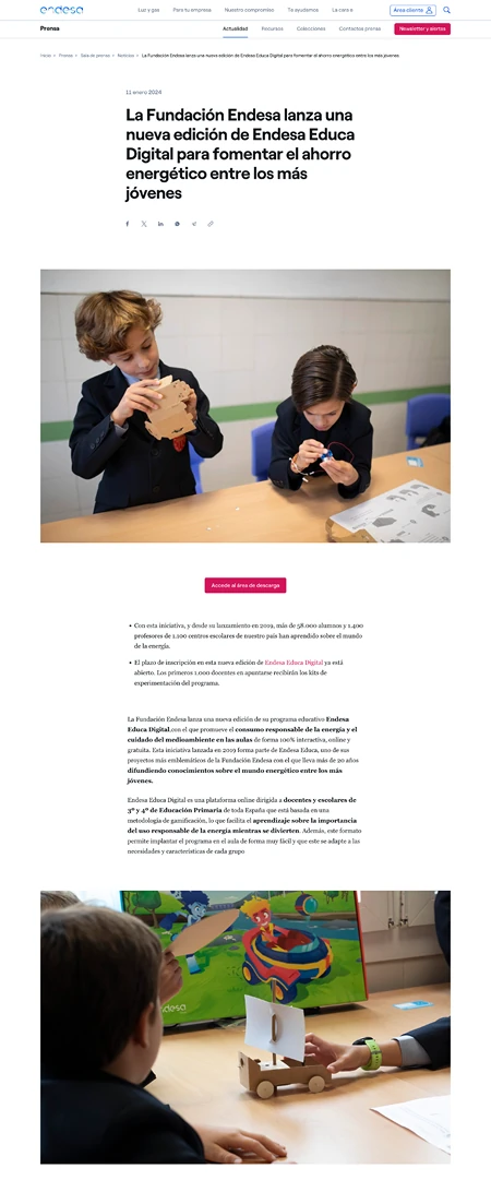
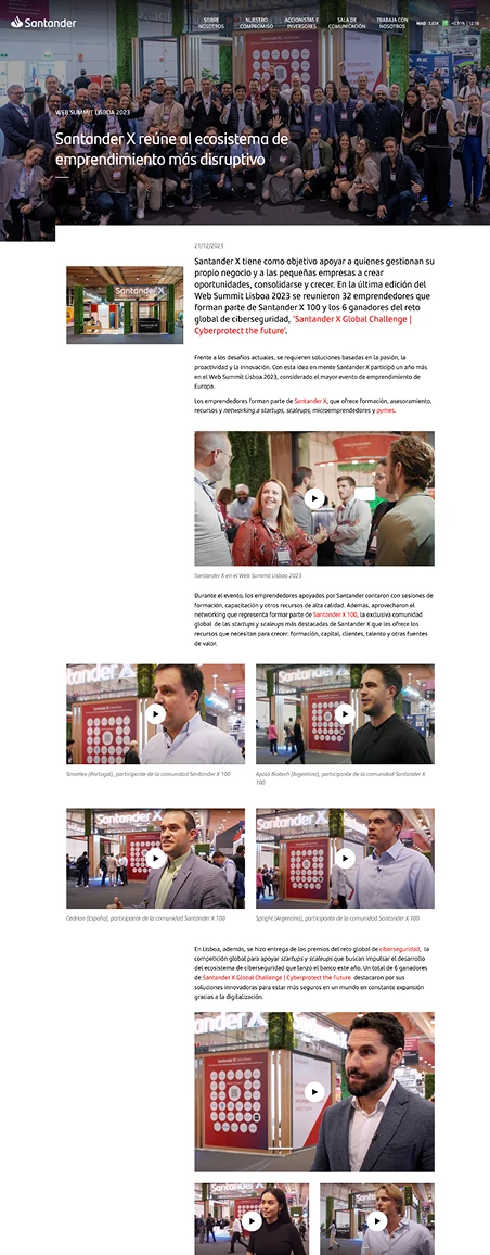
Repsol article detail page patternEndesa article detail page patternSantander article detail page pattern

Cross-selling

Related article suggestions at the end of each piece.

Downloads

Downloadable content sections (press release PDFs, images, video).

Reading time

Estimated reading time displayed on each article.

Tags

Content tags that link through to topic landing pages.

Putting the research to work

Once the research phase wrapped up, we focused on defining the new IA, incorporating everything we'd learned. We ran a workshop with the design and communications teams and worked through four iterations before landing on the final version (v.04).

UCI_v01_Starting point

News &Updates
NewsBlogPress releases
Publications
Press resources
Social media
Spokespersons
Events

CONTEXTUAL ACCESS:

  • Contact

UCI_v02

Press room
News
NewsBlog
Press releases
Publications
Events
Press resources
Social media
Contact

CONTEXTUAL ACCESS:

  • Spokespersons

UCI_v03

Press room
Updates
NewsBlogPress releases
Events for professionals
Press resources
Contact

CONTEXTUAL ACCESS:

  • Publications
  • Social media

What makes it into the MVP, and what doesn't

Once the IA was defined, we moved into conceptualization. A big part of this phase was deciding what would actually make it into the MVP and what would have to wait. Working within real constraints, whether time, development capacity, or scope, forced us to make deliberate decisions about what mattered most. Here's how we approached the three main areas:

UCI press room homepage concept
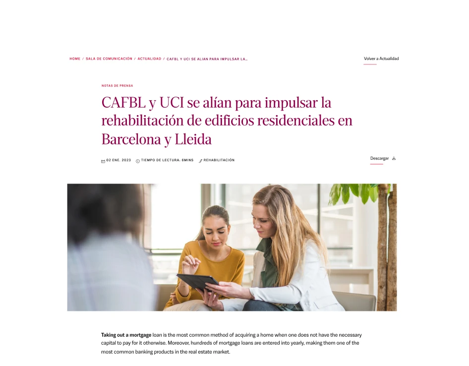
Press release detail page concept
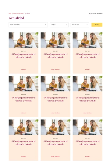
News and updates listing concept

Content strategy

The architecture was designed with each user type in mind. Every key section of the press room maps back to a specific audience, so anyone who arrives finds content that's relevant to them.

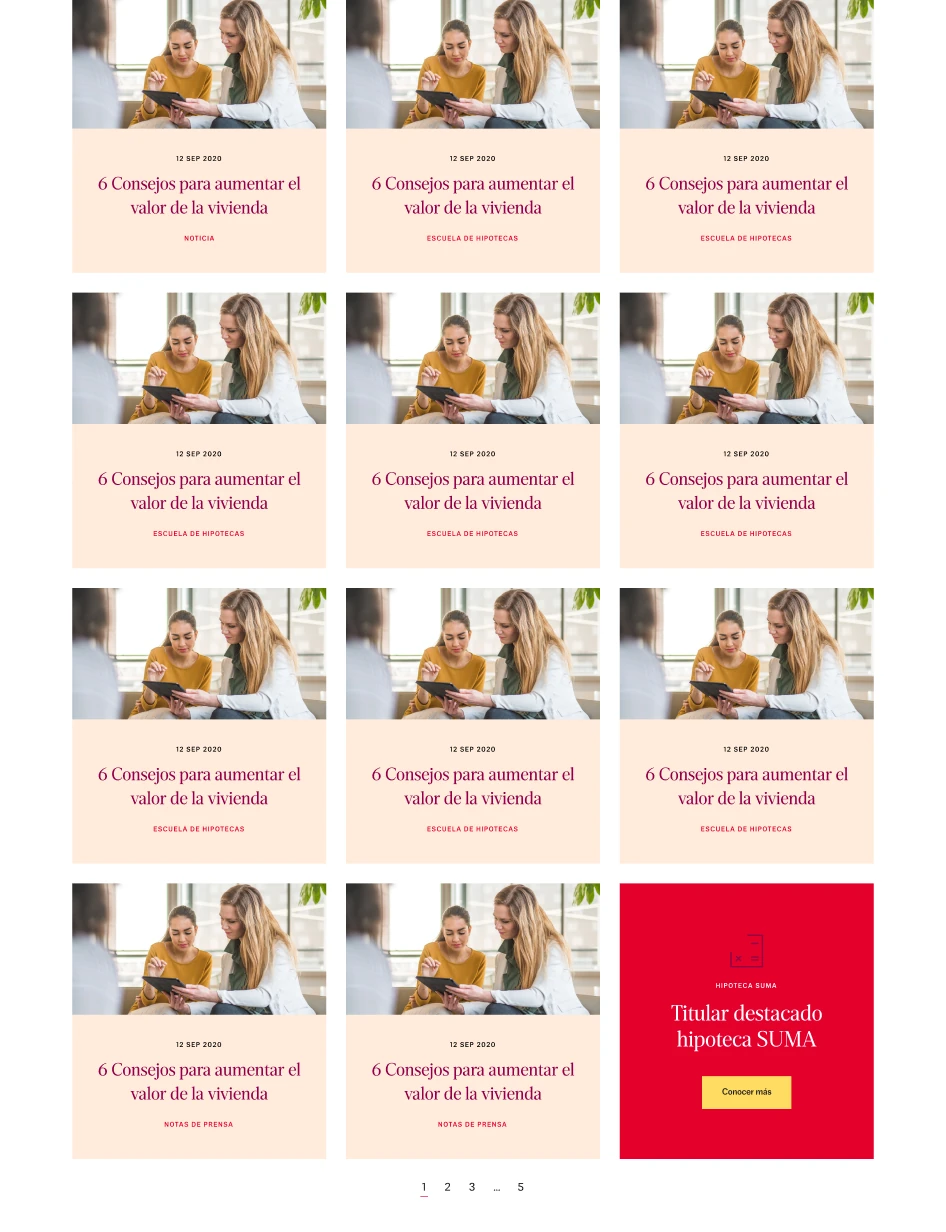
News listing with cross-selling modules
Press release detail with contextual cross-selling

Business cross-selling

We built in contextual cross-selling tailored by user type.

For example, links to specialist mortgage products in content aimed at individual users, or links to renovation-related tools in articles tagged with relevant topics (like the Energy Efficiency Calculator).

UCI press room built with existing design system components

Design system

For the first MVP, we used almost exclusively existing components from the Design System.

For any modules that didn't exist yet, the development team estimated the effort involved, and we decided case by case whether they'd go into the MVP or a future update.

The project was successfully delivered and launched.

You can explore the final result at uci.com. Due to the nature of agency work, our contract with UCI wrapped up shortly after delivery, so I wasn't able to track longer-term metrics or iterate further. But seeing it live is, in itself, a good ending to the story.

View live projectView live project

Designers aren't blockers. We're an accelerator.

One of the things that made me reflect most on this project happened right at the start. The press room was on a push to launch quickly, without having been properly thought through or with much consideration for the people who'd actually be using it. When our team stepped in, we were initially seen as a bottleneck.

That perception shifted as soon as we started sharing research findings and data. The business and communications teams realized we were working toward the same goal. Changing that initial impression is part of the job as a designer and while it can be exhausting, it's one of the most valuable things we can do.